...

New Packaging, Play Energy

energy-drink-packaging-design

Flavor Expansion, Design Consistency
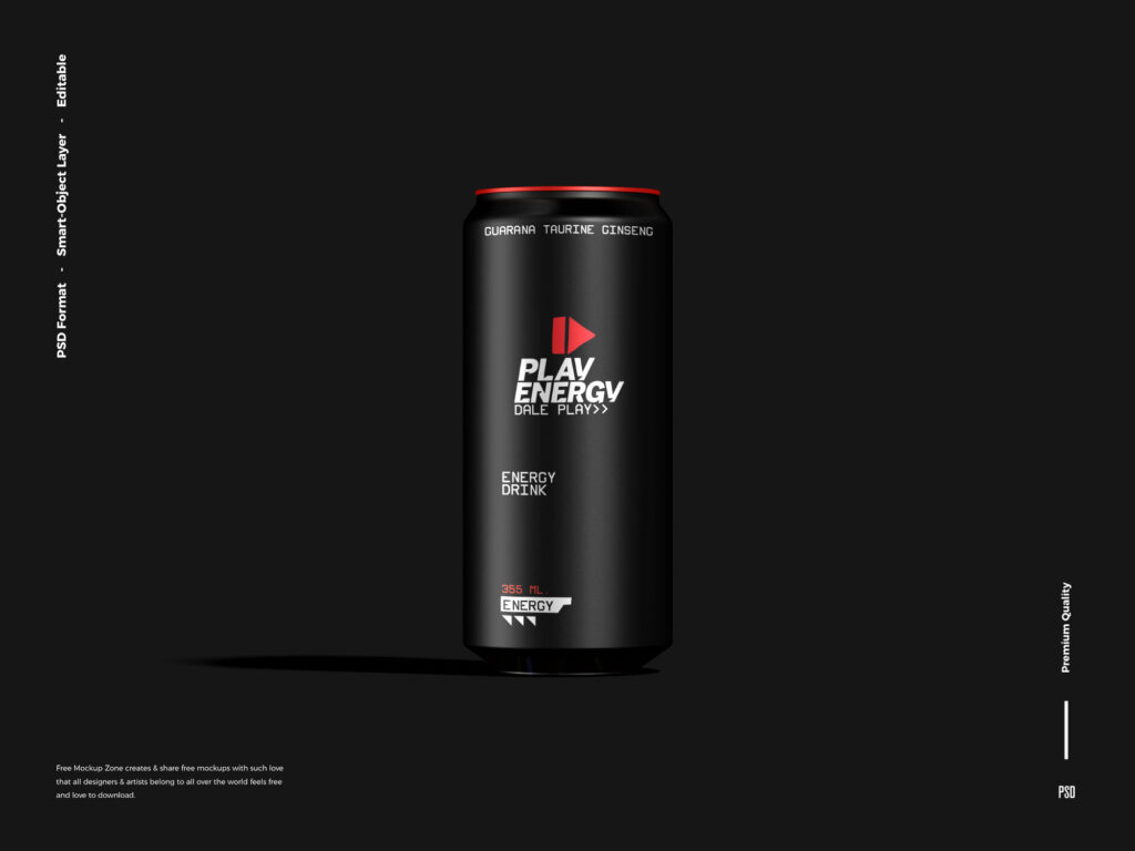
With the introduction of new flavors and sugar-free versions, Play Energy resisted the industry trend of changing colors per variant. Instead, it maintained its black-red-white palette, using subtle visual cues like fine line patterns, iconography, or flavor tags below the logo to differentiate each product. This decision solidified the brand’s visual discipline and reinforced its premium, high-intensity identity.

Premium Minimalism
In an effort to elevate the brand’s maturity and appeal to both hardcore fans and new health-conscious consumers, the can design was streamlined. Excess visual noise was removed. The matte black became deeper and more tactile, the fonts cleaner, and the red elements slightly metallic. This version leaned into premium minimalism, inspired by high-end tech brands.

Function Meets Form
Play Energy introduced ergonomic can ridges and anti-slip coating for users on the go — especially athletes and late-night workers. The packaging featured white iconography denoting function (focus, stamina, recovery) while the core design remained untouched: matte black, red logo, white supporting text.

Timeless Identity
Today, Play Energy is known for its uncompromising color scheme — a matte black backdrop that screams stealth and strength, accented by red for energy and white for clarity. The brand continues to innovate within these boundaries, incorporating embossed textures, subtle foil details, and augmented reality-enabled cans, but its commitment to its core look has made it iconic and instantly recognizable.

Share:

More Works

oliver-ranch-logotype
Logotype

Oliver Ranch Logotype

The Evolution of the Oliver Ranch Logo Inspiration and Origins – 2024In late 2024, the owners of Oliver Ranch approached the branding team with a clear vision: they wanted a logo that captured the timeless, rugged heritage of the American West—one that could stand the test of time, just like the great ranches of history. Their creative inspiration? The bold and instantly recognizable “Y” brand from Yellowstone, the hit series that had rekindled interest in Western culture and the romance of ranch life. The owners didn’t want a direct copy—they wanted a modern legacy brand that spoke to authenticity, resilience, and the land. Thus began the journey of the Oliver

Read More »
Branding

Identity of “Elvesso Coffee Roaster Co.”

Every coffee bean holds a story worth telling. Elvesso Coffee Roasters Co. was born from the desire to build a direct bridge between true coffee artisans and those who value authenticity in every cup.Through Freedom Coffee, we work hand in hand with small independent producers, ensuring they receive fair payment for their passion, time, and land. Elvesso is not just coffee: it’s respect for origin, gratitude toward those who cultivate it, and a commitment to a more human way of doing business.We carefully select beans of exceptional quality, roast them with art and precision, and bring them to you — so that every sip becomes a tribute to the hard

Read More »
Works

The Blue House and New Baja Lifestyle

Fausto Polanco’s Furniture New 2024 Collection We Work In a New Fausto Polancos Artisans Project, the new Summer ’24 Collectios of Beach furnitures made by Mexican artisans & the Blue House the new Point of Sale in inspires in Fida Khalo’s House and Museum in the city of Mexico.

Read More »
Tijuana_SanDiego_West_Coast_Crafted Beers
Branding

Crafting a Brand

The Rise of Artisanal Beer in Ensenada, Tijuana, and San Diego In the evolving world of branding, few industries have embraced authenticity, storytelling, and community like the craft beer scene. And in the cross-border region of Ensenada, Tijuana, and San Diego, craft beer is more than just a product — it’s a brand ecosystem that reflects identity, creativity, and cultural fusion. Ensenada: Brewing with Character and Coastal Identity Known for its wine culture, Ensenada is now carving a name for itself as a hotspot for artisanal beer. Brands like Wendlandt, Agua Mala, and Transpeninsular have developed unique identities grounded in their geography, storytelling, and visual design. Whether it’s nautical themes

Read More »

News Subscribe

energy-drink-packaging-design
Translate »
Seraphinite AcceleratorOptimized by Seraphinite Accelerator
Turns on site high speed to be attractive for people and search engines.