First Impressions Matter

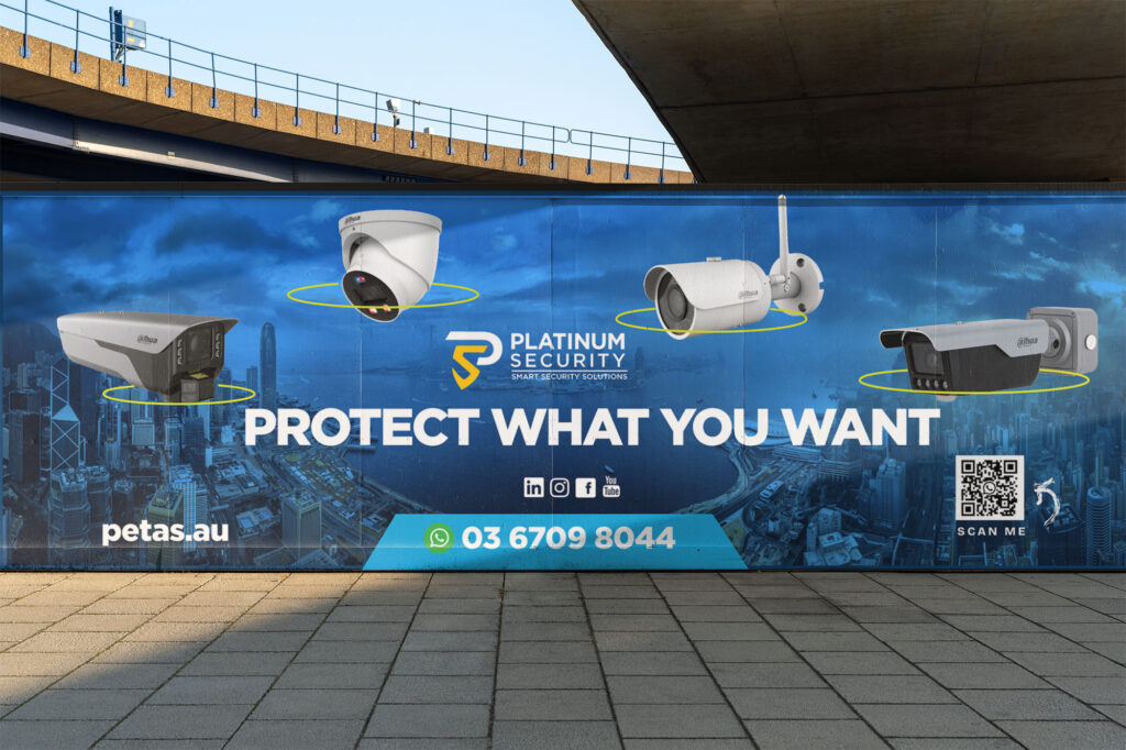
Billboard Design for Platinium Security at Sydney Airport ✈️🔐

We were proud to design a high-impact billboard for Platinium Security, strategically placed in one of the busiest areas of Sydney International Airport.

As a leader in smart security solutions, Platinium Security needed a visual statement that could instantly communicate trust, cutting-edge technology, and 24/7 protection. Our creative approach focused on a clean, modern design that delivers a powerful message in just a few seconds.

Key elements of the billboard:

🔒 Strong, direct tagline: “Smart Security. Protect what you want.”
🧠 Futuristic graphics representing AI, remote monitoring, and real-time protection
📱 Visual icons for smart cameras, access control, integrated alarms, and more
🎯 Sleek color scheme and bold typography that conveys professionalism and authority
📍 Location: International Arrivals area at Sydney Airport — visible to thousands of travelers daily

This billboard not only reinforces Platinium Security’s global presence, but also delivers a confident, technology-driven brand message right at the first point of contact for international visitors.


📍 Platinium Security – Smart Security Solutions for a Safer World
🎨 Billboard design by Creativa Norte Marketing

Share:

More Works

Brochure

Design With Purpose

Institutional Brochure for MSR Collective 🌍🤰🏽 We had the privilege of collaborating with MSR Collective, an international non-profit organization dedicated to tackling one of the most urgent public health challenges in Africa: maternal mortality in Nigeria. Our mission was to create an institutional brochure that not only informs but also moves, mobilizes, and inspires action. From the first sketch to the final layout, every design decision was made to reflect the humanity, urgency, and hope behind MSR Collective’s work. Key Stages of the Design Process: 🔍 Deep Research and Visual EmpathyWe began with a deep dive into reports, statistics, and real-life stories to understand the impact of MSR Collective’s work.

Read More »
Graphic Design

Design That Sails Worldwide:

Corporate Brochure for Ship’s Lobster 🌊🦞 At Creativa Norte Marketing, we had the pleasure of designing the new corporate brochure for Ship’s Lobster, a Canadian company with a strong legacy in sustainable lobster fishing and global export. The goal was to create a visually striking and informative piece that highlights both the premium quality of their product and the international reach of their operations. The design strikes a balance between elegance, clarity, and maritime character—positioning Ship’s Lobster as a trusted supplier in the global seafood market. Key elements of the brochure: 🦞 High-resolution photography showcasing the freshness and presentation of the lobster🌍 Global distribution map and export capabilities⚓ A refined

Read More »
Graphic Design

Promotional Flyer for Strong Republic 💪

At Creativa Norte Marketing, we had the challenge and privilege of designing a powerful new promotional flyer for Strong Republic, a premier personal training service based in the heart of Coachella Valley.

Read More »
website-development
UX/UI

🧀 Quesos Excelsior’s New Website 💻

We Redesigned the Flavor of Tradition: At Creativa Norte Marketing, we’re proud to showcase one of our most recent projects: the complete redesign of Quesos Excelsior’s website, a beloved Mexican brand known for its artisanal, high-quality cheeses. This redesign wasn’t just about visual updates — it was about creating a powerful, modern digital presence that reflects the heart of their brand while improving user experience across the board.

Read More »
adiuva -newlogotype
Branding

The Brand of Adiuva Liegenschaft

The Brand and Logo History of Adiuva Liegenschaft Founding Vision – 2015Adiuva Liegenschaft was founded in Stuttgart, Germany, in 2015, at the crossroads of tradition and modernity. From the outset, the founders envisioned more than a property company — they aimed to create a brand built on support, stewardship, and trust, all rooted in the meaning of “adiuva”, the Latin word for “to assist or support.” The company would not simply sell real estate; it would guide families, investors, and communities through complex transactions with integrity and care. 2015 – The First Logo: Classical Foundations The first logo reflected this classical inspiration. It featured: This version was formal, trustworthy, and

Read More »
oliver-ranch-logotype
Logotype

Oliver Ranch Logotype

The Evolution of the Oliver Ranch Logo Inspiration and Origins – 2024In late 2024, the owners of Oliver Ranch approached the branding team with a clear vision: they wanted a logo that captured the timeless, rugged heritage of the American West—one that could stand the test of time, just like the great ranches of history. Their creative inspiration? The bold and instantly recognizable “Y” brand from Yellowstone, the hit series that had rekindled interest in Western culture and the romance of ranch life. The owners didn’t want a direct copy—they wanted a modern legacy brand that spoke to authenticity, resilience, and the land. Thus began the journey of the Oliver

Read More »

News Subscribe